Our Final album

Our Final album

Link To Our Website

Our Music Video

Wednesday, 18 December 2013

Interactivity

To increase interactivity on our webpage, we included many ways the fans can interact with the band.

Competitions

 Competitions are a convention every artist and band include in their campaign to gain awareness and fans, and as a debut band, we need to include as many conventions that fit with our branding as we can.


QR Codes

QR Codes are a fairly new form of technology, as they are very easy to understand and implement in everyday life. By including one on our site, we are making it easier for people to access the mobile site. Also, but placing this not only on the website but leaflets as well.


Mailing Lists

A mailing list is important to keep our fans updated on the latest news surrounding the band.

Interviews


Our research showed that a convention for rock bands was to have interviews with rock magazines, such as Kerrang! and NME, so we created a fake interview with Alternative Press who have had interviews with bands such as Paramore, Fall Out Boy and Evanescence. We put this on a page on our blog, so fans of the band could learn more about them.

Monday, 16 December 2013

Homepage

After our research on websites, the homepages all had a variety of similarities including:

  • The name of the artist/band
  • The latest product (album)
  • A brief summary of the latest news
  • Latest tweets
  • Links to all social media associated with the artist/band
  • Photos of the artist/band
  • A row of buttons linking to other pages
  • A colour palette that fits the branding of the campaign


We have tried to include all of the conventions stated above, as well some different techniques like the QR Code that is not yet as common on many artist/band websites.

Developing the Branding

Along with our strong brand identity portrayed by the purple throughout the marketing campaign, we have also implemented triangular imagery displayed in a variety of mediums, ranging from the digipack to the website.

We wanted to further promote the electro aspect of our band identity, so buy using the angular shape we hope to better the visuals of our branding.


In the digipack, the branding continues to the inside left cover where all four band members are seen with a faded white triangle mesh where various triangles are semi-transparently filled in with a purple colour. We want this to further create an obvious brand to not only our target audience, but also secondary and general audience that might be impacted by our marketing/advertising as a way for our campaign to be memorable.


Development of Front Cover

Front Cover

Our initial idea has remained unchanged for the front cover. We managed to use the Snazaroo face paint to create a fairly thick mix to pour over Anjana's face. 


As the paint was more blue than we had planned, we masked around the paint to create a more purple tint, which worked well. Also, we put the two drops at the bottom infront of the title, as that creates a more 3D element to the picture rhat could be interesting.

Friday, 13 December 2013

Development of Back Cover


Back Cover

Initially for our back cover, our idea was our feet surrounding a bucket with spilled paint. After our photo shoot though we realise we weren't able to take that shot, so we thought this picture would be better as it still has that sense of anonymity mixed in with our branding, shown with purple paint. This branding is still unchanged, and we managed to incorporate it well in our photoshoot.

Music Video Feedback

We received feedback from our media technician on our music video. He went through it in detail and gave us very specific things which should be changed in order to get a better video. The list of feedback is as follows:
  • 00:02:01: Dead shot of Alex
  • 00:02:23: Feet shot is a bit random
  • 00:00:00 - 00:08:00: Add in CU/ECU
  • Have an introduction to Dani California as a pre-video to the music video
  • 00:24:11: Loose shot - too much empty space
  • Change shots of Emily looking dead in the background
  • Unnecessary jump cuts, add new shots
  • First bridge has no impact
  • More solo shots of Sam playing the guitar in the guitar solo
  • Also in solo, have less shots of bad scenes
  • More power shots in the ending
  • Final shot is too long
  • Add more CU/ECU/BCU throughout
  • More Anjana face belting
We will now aim to fix these problems.

Wednesday, 11 December 2013

Merchandise

Our merchandise needs to appeal to a wide audience as well as core fans, so these are a few ideas of merchandise we could have:


Wednesday, 4 December 2013

Paint Research

As our album cover had paint dripping on each person's face, we had to research paints that were non-toxic and safe for our skin.

We decided to look on Hobby Craft, as we knew that they would have the sort of thing we were looking for.

After looking at many different options, we think that this Snazaroo Purple face paint, after being broken down and mixed with water, will offer a good idea of what we are looking for.

Tuesday, 19 November 2013

Seventh Shoot (Pop Music Video/ Accepting Award/ Fansigning )


For the pop music video, we had to make sure it complemented the narrative without interfering with the actual performance scene. To accomplish this, we included backup dancers, a choreography and a very vibrant, pink background. Anjana's flowery dress is a reoccurring image throughout the narrative.


To not make our scene of Anjana (Dani) accepting the award too empty, we made sure we had tight framing. We had to reshoot though, as the lighting was too bright on our actors at some moments.


As this scene is really fast in the music video, we had to take enough shots to make sure the narrative made sense, so we could edit through the shots fairly quickly.


For the fan signing, the back wall was very important as it represented the scene but also had to look different to the red carpet scene. We achieved this by having a really big poster of Dani California and having the album and sponsor more spaced out than the red carpet logos.


Wednesday, 13 November 2013

Fifth Shoot (Second Performance Shoot)

 For our second performance shoot, we learnt from our first attempt and managed to set the lighting much faster. We increased the intensity of the floor lights to improve the lens flare. We also changed the set up of the guitarist and keyboard player by switching them around. This improved the shot quality as it allowed Anjana (Dani) to move more freely to both Sam and Alex. We also improved our performance skills to make sure we weren't looking dull on camera.


Saturday, 9 November 2013

Fourth Shoot (Photoshoot)


 For our performance shoot, it took almost 2 hours to set up the lighting and instruments and get the costumes and makeup ready. We did not foresee that it would take so long, and will keep that in mind for later shoots. The hardest part was moving the roof lights manually to where we needed them to be, and ensuring there were no visible shadows and that all band members were visible in the correct lighting.
Also, on the camera it looked like some band members weren't moving around as much as others, so it took time to perfect the band 'look' we were going for, but by the end we managed to get what we needed in this first shoot.

Thursday, 7 November 2013

Third Shoot (First Performance Shoot)


This was our first studio shoot, and was fairly simple in the lighting that we needed. We were portraying the photoshoot scene where the popstar poses seductively and playfully for the photographer.

It was a very smooth shoot and we got a lot of material from different angles we experimented with and different styles of shots.


As we planned to have our band members (other than the lead singer) make cameos in the narrative, here, Chloe (the drummer) makes a cameo as the makeup artist of the popstar. To ensure the audience realise it's a cameo there is a close up of Chloe.

Tuesday, 5 November 2013

Album Cover Mock Up for Popstar

For the popstar, we need to have promo images for her album cover and posters (for the album signing). I made this rough album cover of what the album cover could potentially look like, so after we've taken the shots of the popstar, we already have a basic template to put it on.


The font is very playful and cute, while the shot of the popstar is very polished and there is a beauty shot of the popstar looking at the camera. The background is simple (but this can be changed in the future).

Album References for Dani California's album

As part of our music video, Dani's pop persona needs an album cover. In order to see the sort of artwork which Dani California's album should have, I did some research into typical pop album covers. Here are some of the pop star album covers which I found, from which inspiration could be drawn:


As can be seen a typical pop album cover uses a well lit beauty shot, and a simple background. It also uses a font for the Album title and name of the artist. We will use this as inspiration for the construction of our pop star's album cover.

Shoot Schedule 3


Shoot Schedule 2


Saturday, 2 November 2013

Second Shoot

For the swimming pool shoot, we didn't have much space for Anjana to move, so we focused more on expression and hand/feet movements. Because of this, we took a lot of close-ups/mid shots of Anjana with props etc. 

Initially we planned on having just the swimming pool scene for a section of the music video without editing to and from the performance, but we're not sure if that would be too monotonous, so we plan on testing this out and seeing what would be best.

Thursday, 31 October 2013

First Shoot

These are some pictures I took while filming of the different locations and setups on the day of the shoot.


 For the arguing with boyfriend scene, we wanted to portray night time, while still having regular indoor lighting. As the wall/curtain was very near our actors, the main problem we faced was huge shadows and having to reduce them. By having a light next to the sofa (top right picture) we managed to make the shadows less visible. Also, this was only a problem while we were shooting our master shot, as when we would be shooting handheld/ closer shots, the angles we chose meant shadows weren't a proble.


This is roughly another angle which we shot from as this was a conversation scene. Althugh the editing will be non-linear, we wanted to keep some sense o the 180 degree rule.

This was our setup for the crying scene. The framing here was much tighter and closer than originally intended, but we thought there would be a greater impact this way  

Tuesday, 29 October 2013

Shoot Schedule 1


Technical Presentation

We gave a presentation to our class and our teachers about our technical planning. We then received feedback and answered questions. Here is the slideshow we used during the presentation:

Giving this presentation ensured that we had properly thought out all aspects of our music video, allowed opportunity for others to point out things we may want to consider before shooting our video and the solidarity needed to present these aspects to a class ensured that we even doubly certain of how the technical aspects our shoots would operate within our own group.

Friday, 25 October 2013

Album Cover Mock up

To help us plan out our album cover as well as to ensure that everybody was clear on what we wanted to achieve from the album cover, we created mock-up covers on photoshop. Our initial research in album covers can be found here

Front cover with both black and white backgrounds:


The white background works well to contrast with the purple paint on the face, and as our lead singer has a darker complexion, it seems it will work better. The red lips are very prominent and the brightness of the colour can further promote a modern aspect to the album cover that we need to appeal to a modern audience interested in electro as well as rock. 

The album name and cover are purple to comply with the branding of the band and be synergistic with the campaign. The font is also the same to what it will be on the website. The album name may still change, but will be smaller than the band name to differentiate from the band name.


Back cover:


The back cover will be the bottom half of the band members standing our a fallen bucket of purple paint, staying with the theme of paint from the front cover. The track list will also be in purple to comply with the branding.

Thursday, 24 October 2013

Album Cover Idea

Our idea for the theme of the album artwork is based around paint.


On the front cover will be a picture of the lower half of Dani's (Anjana's) face, and dripping down it will be purple paint. This fits with the band's branding of a signature colour.

The back cover will feature the legs of the four band members standing on top of a dirty canvas such that it implies they are looking down at a dipped up purple bucket which is by their feet.


The inside covers will contain photos from a photo shoot of us playing around with paint, and posing so that it looks like we are having fun as a band.

Storyboard

We created a storyboard in order to visually represent what we wanted in our video and so that we knew what shots we would need and how they would look. Here are pictures of our storyboard:

Section of song          Close-ups/ECUs          Mid Shots          Long Shots/ELS          Repetition of performance shots


This storyboard will be helpful as it makes sure we all have a clear idea of what our shots will look like.

Social Media

With our social media, we want to be avid users of many online platforms such as Twitter, Facebook, Tumblr and Youtube. This would allow fans to interact with us and also see our inspirations and our thoughts on different popular culture.

Twitter: 


On the twitter, we each talk about things inspired from our personalities and characteristics. The imagery and theme continues on from our music video and album, with purples visible throughout.

Tumblr:


On tumblr we reblog posts with similar imagery, meaning and atmosphere that inspired our music video and brand in general.

Facebook:

https://www.facebook.com/wefallapartband

On facebook we connect with our fans directly, engaging them with upcoming content, and keeping them involved with the latest news and band gossip.

Youtube: 


Here we've already posted a behind-the-scenes video of our band practising in the studio, which helps fans feel closer to the band and also helps improve our online presence.

Sunday, 20 October 2013

Profile for Chloe


In order to to bring our band to life we've decided to give each band member a specific style, look and personality. While following some synergistic qualities (such as the purple colour scheme), we want each band member to stand out. Here is the profile for the band member Emily is playing as, Chloe:

Name: Chloe


Age:19


Personality Traits: Funny, relaxed, Genuine, Confident


What they stand for: Expressing yourself through music, and being passionate about what you love


Links to other band member profiles:
Lead Singer
Guitarist
Keyboard Player/DJ

Saturday, 19 October 2013

Women in Rock

In order to see how we could conform to or challenge the conventions of representations women in rock, we looked at different women in rock and how they are portrayed within the band.
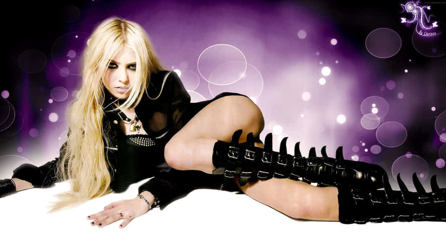
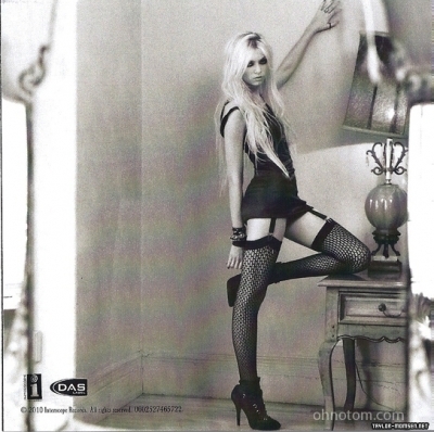
Taylor Momsen

Taylor Momsen is the lead singer and front women for The Pretty Reckless. The band, who formed in 2007 have an aggressive musical style. While she has separate acting and modelling careers, within the band, Taylor is sexualised


Tay Jardine

Tay Jardine is one of the singers for the pop punk band We Are the In Crowd, which formed in 2009. Tay is not as sexualised as Taylor Momsen, instead she is shown as having fun.


Jenna McDougall

Jenna McDougall is the lead singer for the Australian pop punk band Tonight Alive who formed in 2008. She usually wears casual clothes, which often show her forourite bands or feature interesting designs.
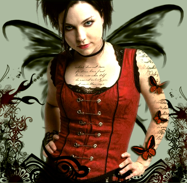

Amy Lee

Amu Lee is the lead singer of Evanescence. She is presented in a more gothic manner than the previously mentioned women. 


As can be seen the different women in rock can be shown as quite sexualised to more casual. We hope for our female band members to be represented by a more casual, friendly look.